queen west residence
queen west residence
About this project
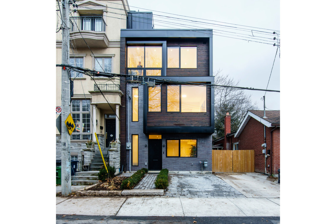
Sited on the back half of a narrow downtown lot in the Queen West neighbourhood of Toronto, construction on our Queen West Residence is now complete and the home is finally occupied.
Preliminary design work began back in the fall of 2012, however a number of complications with variances, permitting and consequently the need to apply to OMB, unusually meant that construction didn’t actually begin until the spring of 2017. The project in this sense was incredibly unique, requiring a great deal of patience at every turn.
The clients original wish list included integrating two bedrooms, both with en-suites, open plan living, kitchen and dining spaces, a powder room, as well as an integrated garage, home office and roof deck to take advantage of the downtown skyline. Whilst early iterations included an integrated garage, subsequent meetings with the city led to its exclusion, and instead the integration of a parking pad to the front yard.
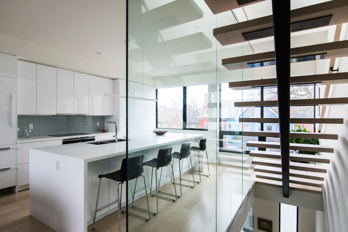
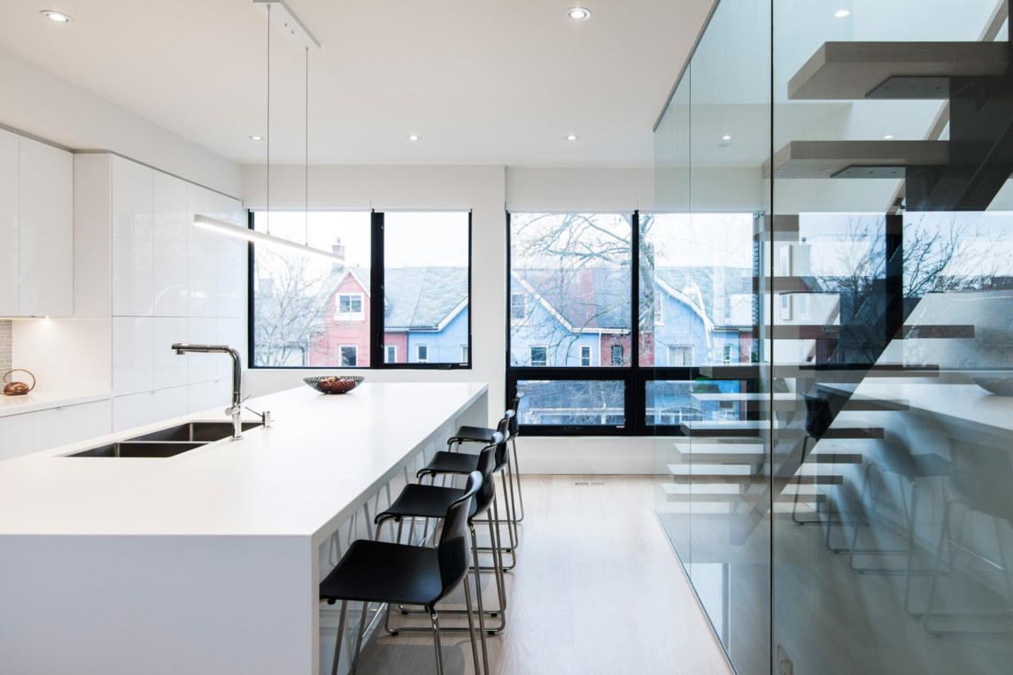
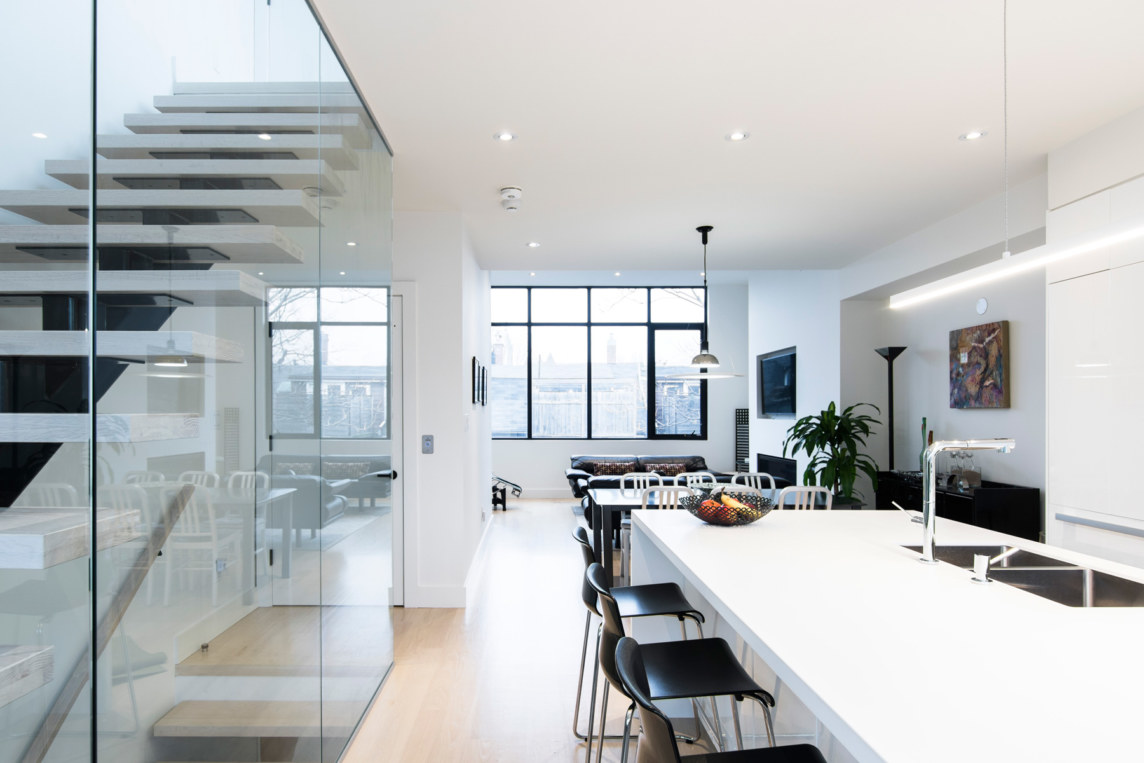
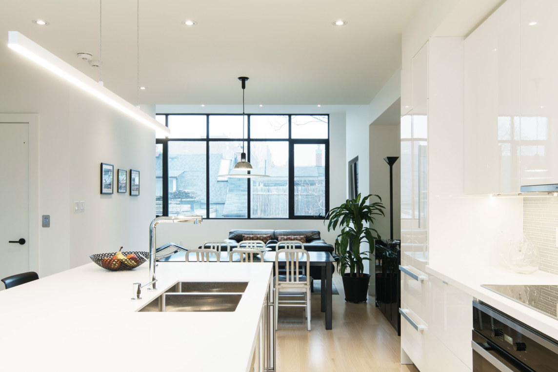
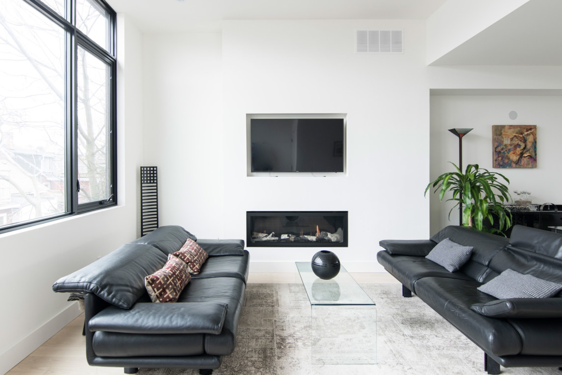
As a response to our clients wish list we developed two key parti diagrams. The first addressed the vertical flow of the building by redefining the approach to stacking the living spaces. Instead of the primary living areas being located to the ground floor and the bedrooms occupying the upper levels we explored flipping the program, locating the kitchen, dining and living to the third floor, with direct access to the roof deck. The ground floor consequently was retained for entry space and the home office, with the second floor home to the bedrooms. In order to make sense of this layout the introduction of an elevator was an obvious choice.
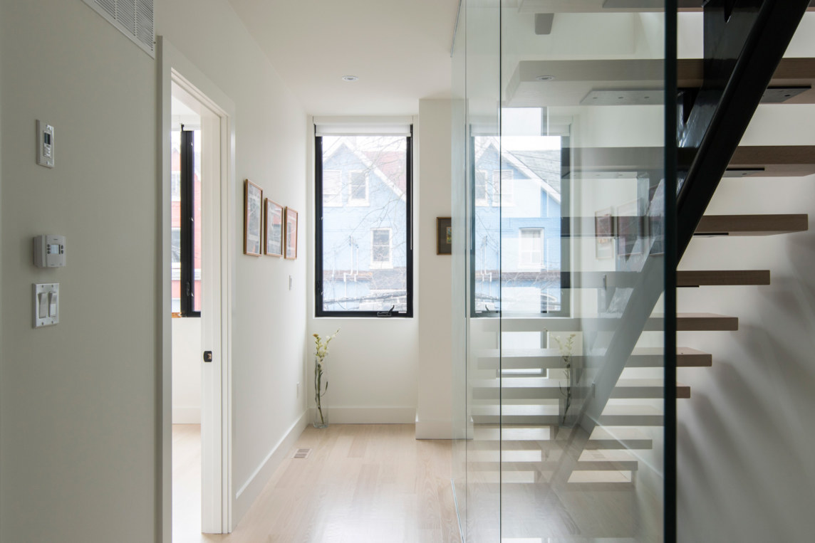
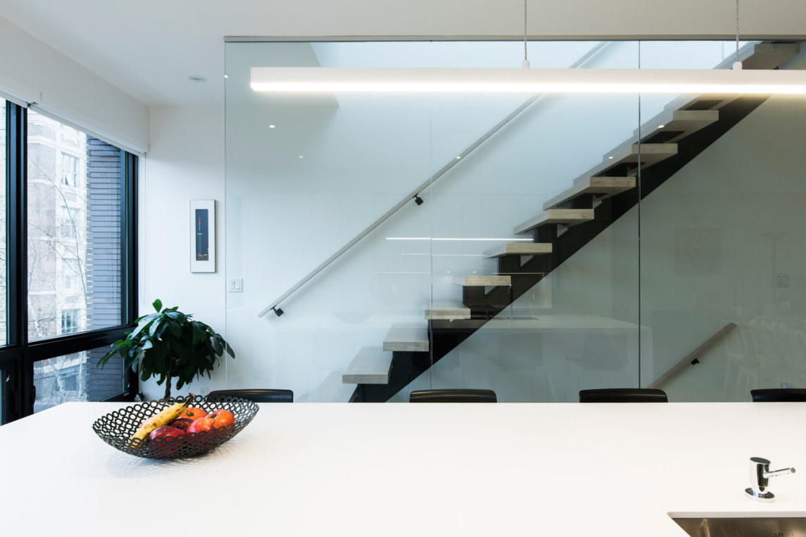
With such a narrow and shallow lot we were quite restricted with the potential layout options and so it became apparent early on that variances to borrow additional width from the lot would be highly beneficial. The reduction in side yard setback afforded us an additional metre of interior space which consequently allowed us to explore and implement our second parti diagram which discussed the need for a rational and clear idea on how to best organize the horizontal flow of the building. To this end, we located all vertical circulation in an east-west orientation across the north edge of the building, with all primary living spaces feeding off this to the south. This enabled a better proportion of space and minimal loss of floor plate to circulation.
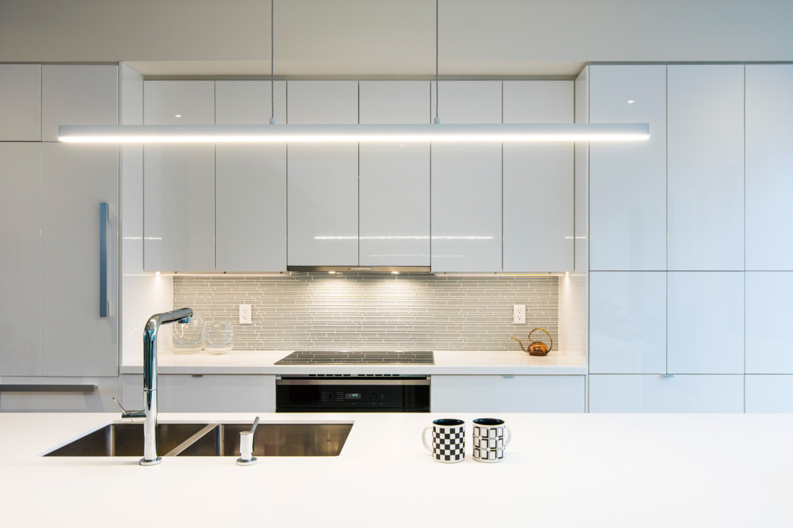
Above and beyond these more literal spacial decisions and their overall need to remain practical and well thought out, it was also imperative for us to consider the ease of maintenance of the building. This, like the practicality of the buildings inner workings was a priority for our clients.
To this end various facets of the design embraced a ‘low maintenance’ perspective, however likely none more than the facade celebrated this in a more obvious mannor. With the introduction of ironspot brick veneer, black metal siding and only a few select areas of sansin protected wood siding (to more protected areas) we arrived at a durable building shell that would require very little maintenance moving forward.
Overall our clients, who have now been residents of the home for several months are delighted that their wish list was able to be incorporated successfully.
